As I promised so long ago, I have redesigned kadavy.net. With the exception of the masthead I’m still going ornament-free (after all of the effort it took to get the Dundee Theater to put my name on the marquee, I wasn’t about to omit that picture), but the typography has been tweaked quite a bit. I’ve also added my portfolio, inspired by Stopdesign’s Movable Type managed portfolio. With some ingenuity, and some modest PHP skills, one can manage all sorts of content. Douglas Bowman (stopdesign) posted a tutorial on making a portfolio with Movable Type, but maybe someday I’ll write a post covering some of the things he left out. Using the Movable Type content management system will make it easy for me to keep my portfolio updated. Other new features are…
During my college years, I had the pleasure of spending a semester in Rome, Italy. The most amazing place in all of Rome, and in what I have seen of the world, is the Pantheon. Built circa 118 A.D., it is one of the Architectural marvels of the world. The 142 foot, almost perfectly spherical dome is supported by 20 foot thick masonry and is topped off with an oculus that permits light (and yes, rain) into the building.
Words can’t do justice to what it is like to enter this space. I’m afraid pictures cannot either, but I’ll give it a try.
I don’t know when this happened, but today I noticed that Craig Kroeger’s miniml.com has gone from a Flash-based interface to a more accessible, search engine friendly, standard’s compliant design. This is ironic, because the pixel fonts sold there are generally for use in Flash and bitmap images, but I think it’s always wise to keep text you would like to have accessible, remain as pure text.
I believe his work to be historically significant because it has taken aknowledgement of the limitations of screen display to the extreme. I also dig the (almost) ornament-free design.
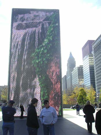
With one eye glued to your TV tonight, glue your other eye to this well-designed interactive map illustrating party distribution for the 2004 election. There are also graphics illustrating past elections, and the progression of approval ratings throughout the campaign. The graphic when you click on “electoral votes” above the map communicates very well.
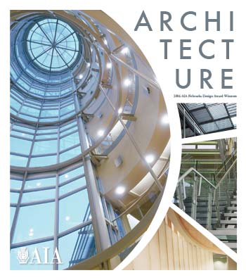
I would have liked to have posted this at a more appropriate time, but better late than never. If you dig back into your archives of the Omaha World Herald, to the Sunday, September 24th edition, you will see the cover of the AIA Nebraska Architecture insert, which was designed by me. If you missed it the first time around and can’t find it in your archives, this is what it looked like.
I would have posted it sooner, but it didn’t cross my mind until one of my readers encouraged me to do so. Apparently, this is the first of the many years of Architecture inserts that has had its cover designed by someone other than someone in the OWH’s fine staff. Every year, the insert announces the AIA Nebraska Honor Award winners.
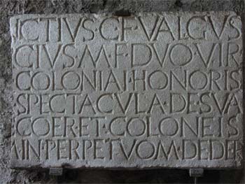
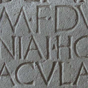
During my studies in Italy, I took this photograph of an inscription inside of the Amphitheater of Pompeii. It dates to sometime shortly after the restoration of the Amphitheater after the earthquake of 62 A.D.. This is a fascinating specimen to me because I think it exhibits the relationship between medium and form in type design.
In Fred Smeijers’ Counterpunch: Making Type in the Sixteenth Century, Designing Typefaces Now, he implies that serifs such as those on the typography of Trajan’s Column are a product of the form derived from brushing the letters on the stone (the type was brushed on before being chiseled in), and trying to complement the one-sided serif that inevitably showed up at each stroke’s terminus (p. 53). This may very well be the birth of the serif, but I think at least for this inscription, the limitations of the chisel spawned the serifs.
One reason I believe the form of these letters is derived from the chisel rather than the brush is the lack of weight variation in the strokes that a brush would yield from changes in pressure. Another reason is that the serifs only appear where a stroke doesn’t terminate into another stroke. You can imagine how unsightly the terminals of a stroke formed by a chisel would look if the designer hadn’t turned the chisel perpendicular to the stroke for a finishing touch. Notice how the “D” doesn’t have serifs, such as would be the case on a brush-derived letter such as Trajan. This may have been the first sans-serif type design were it not for the limitations of the chisel.
Of course, a digital type designer doesn’t have this concern, and it makes it easy to wind up designing a typeface that doesn’t have the rational beauty that tool-derived forms have. This can be difficult to achieve when you’re designing by drawing the outline of a type design, rather than using a tool to draw the individual stroke.
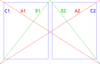
Starting with a two-page spread, draw diagonal lines from one corner of the spread to the other (A1, A2).
Draw diagonal lines from the top-center of the spread to either bottom corner (B1, B2).
Draw a box with the same aspect ratio as your full page (C1), and place it so that B1 intersects the top-right and bottom-left corners of the box, and A1 intersects the top-left corner of the box. A good way to acheive this is to first draw a box the same size as your page, group it, and then scale it proportionally.
Once you have achieved margins that are to your liking, copy your box, and position the copy on your opposite page so that it satisfies the critera from step 3 (C2).
C1 and C2 are your live text areas.
A variety of margin-to-whitespace ratios can be achieved with this method, from the economical to the luxurious. You now have beautiful margins. Best of luck with filling in the rest.
I came across The Visual Thesaurus, which is a fascinating tool for examining the relationship between words. This is a great example of Human-Computer Interaction knowledge at work. Sophisticated visualization applications such as this will continue to bring art and technology together, and demand graphic designers that have a much better understanding of technology, psychology, and the relationship between form and space in establishing hierarchy than today’s graphic design curricula tend to offer.