Subscribe to blog updates via email »
Death to Ornament
I have, for the time being, abolished ornament on my blog. Yes, there is nothing but type on it. For usability’s sake, hyperlinks are still underlined, and the fact that I use color to differentiate information is perhaps questionable in this minimalist approach, but I feel much more free now that I have broken the chains of ornament.
It’s not so much that I think that ornament is evil. I do this to make a statement. Graphic Design’s academic programs, from what I have seen, have chosen to concentrate on visuals, and the copying of “styles,” at the expense of their students’ sensitivity to form and space.
Something such as a blog is, in it’s sublime sense, purely information. Most blogs take advantage of the wonderful semantic markup of the web, which, when used wisely, enables search engines such as Google to find the most relevant information to what you are searching for. There’s increasingly more information out there (duh!) so relevancy is more important than ever. It seems that many college Graphic Design curriculums have forgotten that Graphic Design all starts with the transfer of information (this all feeds into my disdain for all-Flash websites and text in images, but that is for another post, and maybe not even then, because (futile) attempts to pound these concepts into the heads of members of the general Graphic Design community have been made) and I don’t mean “information” as in some esoteric, masturbatory, “concept” you are trying to support, I mean information…the useful kind.
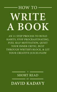
WANT TO WRITE A BOOK?
Download your FREE copy of How to Write a Book »
(for a limited time)
So, rather than learning about typographic nuance, students must resort to rummaging through CA to decide what “look” to copy (many of these “looks” are simply rip-offs of the pop-culture graphics of yesteryear). So, I present to you an exercise in space and form. The form being the letters and word-images, and the space being the space between these forms. It’s like that exercise in school that was a great exercise when taught at the Basel School of Design, and was supposed to teach you that the only necessary factors for establishing hierarchy are: proximity, size, weight, color (I’ll omit “visual punctuation” for the sake of supporting this theory that I simply do not have time to assimilate irrefutable information on), but that somehow got bastardized by your reconstituted design school’s curriculum. In my case, we were assigned to typeset a recipe, which has a hierarchy depth of TWO (ingredients and steps). A couple years later, when I finally realized what the actual objective of that exercise was supposed to be, I had to resort to independently re-typesetting the information on a deodorant bar to truly understand the nuances that establish hierarchy (I’m dead serious…I still have the files if you want to see them).
P.S. I have had the honor of being invited to be an author at Be A Design Group and this post, as well as some other future posts, will appear there as well as here.