Subscribe to blog updates via email »
Proximity Typography Exercise
Here is an image of the type exercise I wrote about in my previous blog:
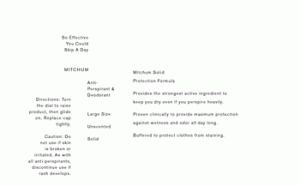
I used only proximity to establish hierarchy in the content (all of the type is the same size). One could also argue that I used different capitalization states. The relationship between space and form in this piece is also based on the Golden Section, but I can’t remember precisely how, nor would I like to reveal the “secret.” It’s still very arbitrary though, I assure you.
WANT TO WRITE A BOOK?
Download your FREE copy of How to Write a Book »
(for a limited time)
Here is a PDF if you’d like a closer look.