Subscribe to blog updates via email »
The 10-Year Design Evolution of kadavy.net
My blog, kadavy.net, has been my testing sandbox for web design and thought experimentation for nearly 10 years now (May 31st will mark 10 years since my first blog post). During that time, kadavy.net has gotten me new jobs, new clients, and eventually, one blog post turned into a book deal for Design for Hackers.
Yes, 10 years is a very long time in blog years, but it could have been much longer. A bunch of Flash experiments preceded the blog, and I made my first webpage, using whatever space AOL gave me with my membership, in 1996.
Throughout 10 years, the blog has been through 4 major redesigns. All along, I’ve tried to evoke certain values about myself and my philosophy, while keeping up with the times. Here’s an overview of the design evolution of kadavy.net.
WANT TO WRITE A BOOK?
Download your FREE copy of How to Write a Book »
(for a limited time)
A Humanist Design Philosophy
In my work and life, I always strive to balance between the powers of technology with those things about humans that we can’t quite crack with technology just yet. So, I’ve always wanted to evoke a “humanist” philosophy in my designs.
I’ve always had an off-white or cream-colored background. From the beginning, this has been inspired by the color of natural, unbleached paper. It was a more intense yellow in the earlier days, mostly because color palettes across users were pretty restricted. So, #ffc was about the softest yellow I could use.
I’m big on minimal ornamentation. I feel really strongly that you can do amazing things with a little white space and alignment, and that you can’t have a beautiful design without mastering those factors. So much so that I wrote a post called “death to ornament”, and removed all ornament (except underlines in hyperlinks) from my 2005 redesign.
I’ve also used mostly humanist typefaces. I started with Trebuchet for body copy for the first two design iterations. I used Georgia for headers, which isn’t technically humanist (it’s realist), but it was the best choice for a serifed typeface for the web, especially back when using custom fonts was difficult-to-impossible. In the 2005 redesign, the site logo is set in Jan Tschichold’s Sabon (humanist). I would have used that for titles had it been feasible and readable.
The 2004, 2005, and 2008 designs used lots of green and beige accents, which were there to support the “natural” color configuration. The link colors in 2004 and 2005 were skewed slightly blue in part because back then it was a big “no-no” to have links that weren’t at least a little bit blue (and underlined). The web was still in relative infancy for the mainstream, so affordance on clickable things had to be pretty heavy-handed.
2004 design, “blogger.com”
In my 2004 iteration of the design, I was really just happy to have a custom design at all. Inspired by David Shea’s CSS Zen Garden, I had started kadavy.net to experiment and learn to use CSS. If you weren’t working with CSS at that time, it’s hard to imagine what a pain in the ass it was. There will still plenty of people arguing that you should use TABLEs for layout, and all of the browser inconsistencies and bugs made them not sound that crazy.
I was using blogger.com, so I did what I could with an existing template. Looking back at the post I wrote when I was first attempting this redesign, I impress even myself at how I was thinking about design with a sensitivity to technology.
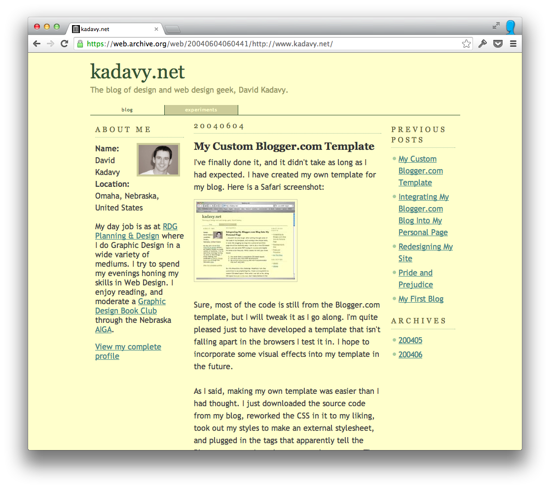
Read the post that introduced the 2004 design.
2005 design, “movies”
At the end of 2004, I took a week’s vacation from work, sat on my couch from 10am–2am every day that week, and redesigned my blog.
At this point, the blog had started to gain a purpose as my place on the web. I not only wanted to showcase my blog posts, but also my portfolio work, and my writings on another blog on which I was a contributing author.
This was the first incarnation of the overall front page layout that I still use: The latest blog post is the most important element on the page, there are a few tidbits from other blog posts, and then there is information about other stuff I’m up to.
In this redesign, I migrated from Blogger to Movable Type, and was inspired by a portfolio Douglas Bowman (now former design lead at Google and Twitter) had hacked together using Movable Type. So, I figured out how to hack Movable Type the same way to use as a content management system for my portfolio.
The movie marquee was just a vision that came to me. My blog felt like a written record of my own journey – a story – to me, and I imagined it as a movie on a marquee. There was also an element to this concept that spoke of my fascination with the idea that the internet was changing the idea of what a celebrity was. (and I was even more not famous at this point)
So, I stood in the middle of Dodge Street in Omaha, and dodged traffic to get a photo of the Dundee Theater’s marquee, on which I then photoshopped the movie title. Notice also that “kadavy.net” has a glow behind it, to echo the visual feel of the marquee.
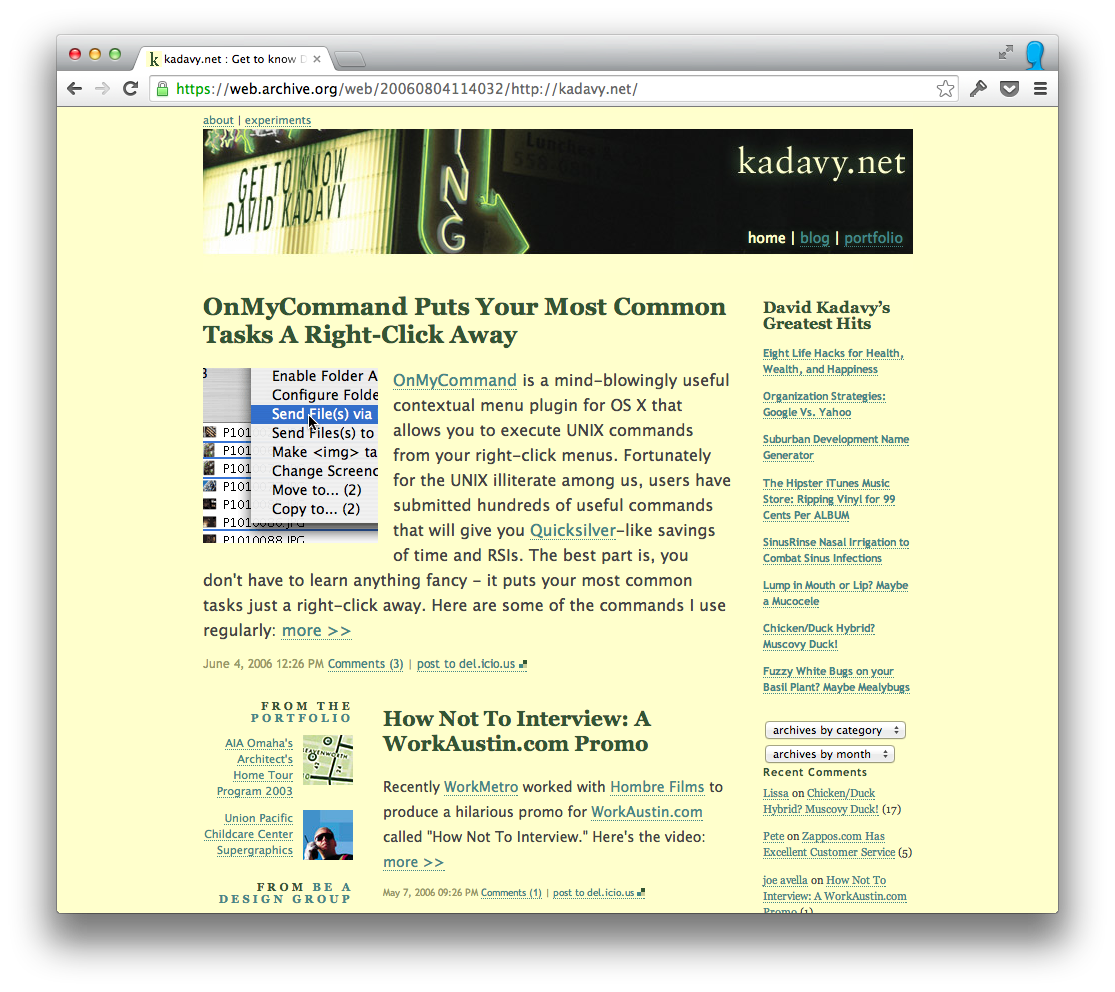
The the blog post for the 2005 redesign, will make anyone who designed for the web back then nostalgic. There are shout-outs to many still-familiar names for helping with inspiration, though many of the links are now dead.
2008 design, “WordPress”
Within a year of the 2005 design, I got a job in Silicon Valley, and was happily working at startups for a couple of years. So, it was awhile before I redesigned again. I was starting to grow frustrated with Movable Type, so I switched to WordPress.
This time, I embraced ornamentation more, making some juicy icons to highlight and visually anchor the various sections on the site. At this point, there were so many different types of information being presented: tweets, comments, portfolio stuff, blog post, “best of,” I felt like I needed more visual factors to differentiate them from one another.
Additionally, cross-browser compatibility issues were still enough of a pain at this point that it was easier to let things be off a pixel or two – and let the ornamentation help out – instead of trying to get all of my white space perfect.
Blue started to creep in as a more prominent color in the design, mostly to make up for the fact that I wasn’t underlining my links anymore.

Read the post that introduced the 2008 redesign.
2013 design, “Snowfall”
Five years passed before I redesigned again, which is a darn long time. The first few years of that, I was busy experimenting, freelancing, and setting up passive revenue streams to do more experimenting. Then, I got the book deal for Design for Hackers, and that kept me pretty busy with writing, promoting, and traveling for a couple of years.
“Snowfall” as I called it, was my main project during one of my mini-lives in Medellin, Colombia. I felt comfortable with revisiting minimal ornamentation because I could design across browsers with more precision, users no longer required so much affordance on clickable elements, and easy-to-use Javascript libraries made it easier to create design elements that were contextually-intelligent. So, certain elements could be exposed only when needed (like the “extruding” navbar, the fadeaway header, and the “notification bar” that pops up at the end of posts).
Snowfall is also the first responsive design for the kadavy.net blog. I designed using rem units, and type scales down easily as the window is resized. Not all elements are simply scaled down, though. Some adjustments are made to keep certain elements legible, while retaining the hierarchy.
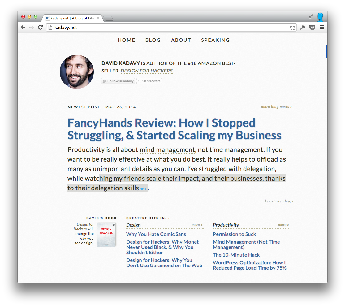 The post outlining the Snowfall redesign has been the most exhaustive of all, explaining all of the technological and business forces that shaped the changes.
What will be next?
Changes in the factors that shape web design have hopefully slowed down, which is part of the reason the spacing between redesigns lengthened through the years, and I hope the current incarnation will last for awhile.
I’m sure that after another 10 years, you’ll just be able to download my thoughts directly to your brain, so the current design is probably the last.