“Need a quick way to transfer files between two Macs? Start up one computer with the T key held down, then plug it into another mac with a firewire cable. The “target” computer’s disk appears on the second mac! Be sure to ‘gracefully’ unmount the target computer’s disk by dragging it to the trash before unplugging the firewire cable. Press the power button on the target computer to turn it off.”
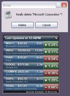
Instead of using a mouse and opening your browser, then navigating through your bookmarks menu to access your weather bookmark, you could press the Quicksilver hotkey (by default, Control+Spacebar), then type the first few letters of the word “weather,” Quicksilver searches through all of your Safari bookmarks, finds your weather bookmark, and when it does, you press enter, thus launching Safari on the page indicated on your bookmark. More than anything, Quicksilver is great for launching applications.
The process saves time and repetitive stress, and can be used in this same manner for many of your tasks throughout the day.
I don’t know when this happened, but today I noticed that Craig Kroeger’s miniml.com has gone from a Flash-based interface to a more accessible, search engine friendly, standard’s compliant design. This is ironic, because the pixel fonts sold there are generally for use in Flash and bitmap images, but I think it’s always wise to keep text you would like to have accessible, remain as pure text.
I believe his work to be historically significant because it has taken aknowledgement of the limitations of screen display to the extreme. I also dig the (almost) ornament-free design.
You may have noticed that I now have Google Adsense ads on my site, and, of course, I have an Amazon Associates account. Of course, the objective of this blog is not to make money. There are certainly more efficient ways to do so. I want to organize my thoughts, share them with others, exchange thoughts with others, contribute to adding semantic value to the web, and hopefully have my thoughts read again many years from now.
That said, I worry myself sometimes when I make decisions that may not provide the best and most honest content possible, in order to have the opportunity to chip a couple cents out of my hosting costs. The main place this may happen, is that when I am talking about a movie that isn’t available on DVD yet, I link to IMDB, which I consider to be the best resource on movies, however, if the movie is out on DVD, I link to that item on Amazon, through my associates account.
I promise, this is as greedy as I will get. Now if I overnight happen to become an expert on real estate (“real estate” probably being a pretty high-paying AdWord string), then you know I’ve lost it.
I hope you find my remarks on books, music, technology and whatever other artifacts that may be linked to on Amazon as relevant and interesting as my comments on anything else. As a critic of Affluenza, I couldn’t, in good conscience, push products I didn’t feel were useful. I also hope that the contents of the Google ads are relevant and unintrusive.
Natural Capitalism recognizes that there are four types of capital in a functioning economy.
financial capital, consisting of cash, investments, and monetary instruments
manufactured capital, including infrastructure, machines, tools, and factories
natural capital, made up of resources, living systems, and ecosystem services
human capital, in the form of labor and intelligence, culture, and organization
“Capitalism, as practiced, is a financially profitable, nonsustainable aberration in human development. What might be called “industrial capitalism” does not fully conform to its own accounting principles. It liquidates its capital and calls it income. It neglects to assign any value to the largest stocks of capital it employs—the natural resources and living systems, as well as the social and cultural systems that are the basis of human capital.”
Amory also explains that in the first Industrial Revolution, there was a surplus of resources and a shortage of people, and that in the next Industrial Revolution, there is a surplus of people and a shortage of resources.
I have not read the book yet, but I imagine it presents even more working models of Natural Capitalism than even Amory’s lecture did. One good example was Interface Flooring (yes the same Interface Flooring that I created my first carpet tile sample rug from). When you think about it, you don’t want to own carpet. You just want to use it for awhile. Apparently Interface is now providing flooring services. They’ve developed carpets that can be re-manufactured with no waste. They install the carpet, come back every few months and replace the worn tiles (carpet doesn’t wear evenly, of course), and re-manufacture those tiles. The result is much less impact on the environment, and its even more economically efficient.