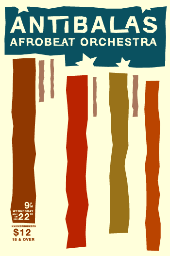
I just completed my latest fun side-project: a poster for Antibalas Afrobeat Orchestra, and more importantly, for One Percent Productions, who organize the absolute best rock shows in Omaha (the music scene is the best thing about living in Omaha). So here is the poster that will decorate the streets of Omaha (and Lincoln…this happens to be for a Lincoln show).
Yes, it is a little Saul Bass inspired. It started out as a visual interpretation of the music. I had some blobby forms to represent the sounds of the horns, some dots for percussion, and the still surviving vertical bands are what the organ sounds like. I felt it should look a little political too, a fact you can’t ignore if you hear their music.
A little disclaimer: the political nature of this band has nothing to do with me doing for a poster for them. The opinions they express are not necessarily mine.
The other day I saw Michael Moore’sFarenheit 911. I was initially disturbed by the film, but, like in Bowling for Columbine, it was obvious that Moore was using dramatic devices to try to persuade the viewer, and I knew that the information presented couldn’t be as simple as he was making it out to be. I found myself wishing that someone would compile retorts to the movie’s issues. Then I came across Dave Kopel‘s Fifty-nine Deceits in Farenheit 911. I haven’t had a chance to read the whole thing, but at first blush it looks like a promising resource for hearing the other side of the story, or to just get an understanding of how Moore manages to persuade the poor people who use his movies as their sole information source.
There are very few things in this world that I know enough about to express a strong opinion on, and politics is far from being one of them. I will spare you from hearing another uninformed opinion on politics, but present this resource for you to form your own opinions.
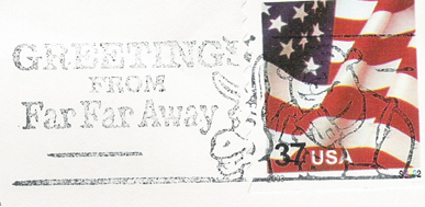
Have you noticed the Shrek Postmarks from our friends at USPS?
This makes me ill. One: pop culture is pervasive enough as it is (which is what makes it pop culture, I guess), and I would rather not have its agents shoved in my face everywhere I go. Two: its one more place you can’t look without being marketed to. Shocked a Graphic Designer is so anti-marketing, or rather this type of marketing? I’m not the only one.
Maybe you’ve noticed that my posts have slowed down a little. It’s not that I have a shortage of things to say in this blog: I have many many ideas in my head…all that require more time and energy than I have at the moment. Work has been pretty busy lately. What do I do at work? Well, my job description, like many employees at RDG Planning & Design, is non-existent (I view that as a good thing). Over the course of my two years there, my duties have included:
Developing Flash-based interactive CDs for the various focus markets
Guiding the firm through a rebranding, and putting together the many elements that weren’t attended to by the Graphic Design firm that developed the new branding system
Managing an image library with a wonderful in theory, not so wonderful in practice, piece of software called Cumulus by Canto
Architectural graphics: coloring floor plans/site plans, touching up renderings, creating materials for 3D renderings
IT for my computer, seeing as I am fortunate enough to have the only Mac in my office
Training other people in the office on Illustrator and Photoshop, and serving as a resource for the myriad graphics related questions that come from a technologically advanced Architecture firm such as ours
Developing a color management workflow (Monaco EZ Color is a great product for this)…yes, I now understand what all those Photoshop Color Warnings are about
Creating promotional boards for showcasing completed projects, creating concept boards for competition entries
Putting together “promos” for responding to RFPs
Determining the optimum printers to have for in-house printing (the DesignJet 5500 from HP is good for the big stuff and we have a great Minolta Laser Copier/Printer/Scanner but I don’t remember the model…there are so many options), and keeping those printers running smoothly
“Scan monkey” and “print monkey” duties (“David, can you scan this/print this?”)
Designing PowerPoint presentations
Designing dedication plaques for buildings
Designing brochures
Creating exterior paint schemes for buildings
Answering the occasional computer question
Making sure various displays around the office support our brand
So, as you may have noticed, I have been almost entirely overhead for much of my days there, and that has kept me busier than your average 9-to-5-er. So far, my record is 67 hours in one week (keep in mind that I still have the book club, other AIGA stuff, and occasional AIA events, too). Well, these last couple of weeks, in addition to having these duties, I have been blessed with some clients. RDG Graphic Design is finally, as I originally intended, bringing in revenue, and as anyone would do, I will make sure that when those clients’ projects are done, there will be no second thought as to whom they will come next time they have a project. Some of the projects I have in progress, or coming up, include a booklet, promotional CD, exterior building signage application, wayfinding, museum catalog and a newsletter redesign.
Fortunately, not ALL of the above duties are still duties of mine. Many people have learned enough Illustrator and Photoshop to do alot of the coloring of floor plans, sight plans, and renderings, we hired a great marketing/writing person to concentrate on promos and color management hasn’t been an issue as of late. Some of the things will seemingly never get attended to, such as the image library (it’s never done!).
I have noticed in my web stats that I have gotten a couple of referrals from Devilfinder.com, a rather odd search engine that I didn’t know about before. “Send me to hell!” says the search button…hilarious.
Safari RSS which provides great RSS support and a new “Private Browsing” feature that keeps everything you visit out of your cache…you know, so you can shop for bithday presents online and your family won’t be able to see where you’ve been 🙂
One thing I found interesting about the search mechanism was that they had programmed in things like “wallpaper” to help former Windows users find where to change their “desktop”. It would be very useful if they could team up with Google and use Latent Semantic Indexing to find relevant, but not necessarily matching, content on your machine.
Here is my one card for AIGA Nebraska’s Design The Hand You’re Dealt. It’s a somewhat De Stijl inspired five of clubs. It’s a simple design derived from a varied scale, in which everything is in proportion to the length of each side divided by the aspect ratio. For example, the cards are 8″ by 12″, so the aspect ratio is 1:1.5, so the varied scale is 12″, 8″, 5.33″, 3.55″, etc.. Each side of all of the elements on this card are one of these lengths, and many of them are the same aspect ratio. There’s still alot that’s arbitrary about the design, I’m sure, but at least I can pretend there isn’t.
Ever been confronted, in Photoshop, with this (totally useless) crop tool icon? Or been using a large paintbrush, and seen this equally useless icon: Even though your preferences clearly designate the “brush size” cursor should be used?
In either case, press CAPS LOCK. You will get the latter icon, which is the only good way to crop, if cropping, and you will toggle back to the “brush size” icon if you are using the brush tool (and your brush size is big enough).
It was quite awhile before I discovered this, and I always thought I had a buggy copy of Photoshop in the “brush size” situation. It seems everyone else I’ve encountered has thought the same, so I hope this helps you.
Most of the pictures you see on this site will have been taken with my Minolta Dimage Xt (its no longer available new on Amazon, but the Minolta Dimage Xg is, and I struggle to see any difference).
I did a great deal of research to find this camera, because I was sick of seeing photo-ops like I was able to capture in CAUTION: Inverted Chairs and not having a camera handy, or going to social gatherings where having a bulky camera was too inconvenient to hassle with. The camera is smaller than my wallet, lightweight, has a flash, zooms up to 3X and with a 256 MB SecureDigital Card, I can take up to 12 minutes of video, with sound, at 320×240 (VHS quality), at 15 frames per second (not VHS quality).
I used this camera to film my ski videos (featuring the music of Criteria), which I edited with iMovie, created the graphic animation with Flash.
The camera is not free of problems, however. Its battery tends to die very rapidly in the cold of skiing conditions, I once had to send it back to the factory for repair (under warranty) because the sliding door that covers the lens wouldn’t operate, and the optics, understandably given the camera’s small size, are not stellar. I also had an issue on a ski trip during which every evening I would replay the day’s movies on the hotel’s television set. After all of that replaying, stopping, rewinding, and slow-mo-ing, some of the quicktime movies became irrevocably corrupted. I now try to avoid replaying my precious videos off of the camera.