The possessions that by far take up the most space in my self-proclaimed lifestyle of minimalism are my books and my records. Until now, I just had a crappy WAL-MART (yes, I went shopping there, but only once, I swear) shelf for my books, and a bunch of cardboard boxes for my records. Besides looking bad, this system also wasn’t very space-efficient, so, since I’m not going to convert my vinyl to CD anytime soon, I decided to search for something much less crappy.
For anyone out there, such as single men, without much experience in the kitchen, I have a small but very valuable bit of wisdom to impart upon you. If you are using your stove, do not put any plates on any of the burners. There is a small chance that you have turned on a burner other than the one you intended – maybe even the burner you have placed your plate on. This will result in a loud sound that sounds like an explosion, likely caused by the aforementioned plate exploding all over your kitchen. Now that you have this wisdom, you will of course, not ever make this mistake, and if you do, you will understand what has caused this well enough to not absent-mindedly attempt to remove what remains of the plate from the burner on your stove, thus burning your fingerprints off.
Natural Capitalism recognizes that there are four types of capital in a functioning economy.
financial capital, consisting of cash, investments, and monetary instruments
manufactured capital, including infrastructure, machines, tools, and factories
natural capital, made up of resources, living systems, and ecosystem services
human capital, in the form of labor and intelligence, culture, and organization
“Capitalism, as practiced, is a financially profitable, nonsustainable aberration in human development. What might be called “industrial capitalism” does not fully conform to its own accounting principles. It liquidates its capital and calls it income. It neglects to assign any value to the largest stocks of capital it employs—the natural resources and living systems, as well as the social and cultural systems that are the basis of human capital.”
Amory also explains that in the first Industrial Revolution, there was a surplus of resources and a shortage of people, and that in the next Industrial Revolution, there is a surplus of people and a shortage of resources.
I have not read the book yet, but I imagine it presents even more working models of Natural Capitalism than even Amory’s lecture did. One good example was Interface Flooring (yes the same Interface Flooring that I created my first carpet tile sample rug from). When you think about it, you don’t want to own carpet. You just want to use it for awhile. Apparently Interface is now providing flooring services. They’ve developed carpets that can be re-manufactured with no waste. They install the carpet, come back every few months and replace the worn tiles (carpet doesn’t wear evenly, of course), and re-manufacture those tiles. The result is much less impact on the environment, and its even more economically efficient.
Friday night I saw Alexander Payne‘s newest masterpiece, Sideways in which the lonely, divorced Miles (Paul Giamatti) takes his soon to be wed friend, Jack (Thomas Haden Church), on a week-long bachelor party of sorts through California’s wine country.
In preparation for dressing up as Holden Caulfield for Halloween (I actually went as Pedro from Napoleon Dyanmite), I have been re-reading JD Salinger’s The Catcher in the Rye, and I noticed an analogous relationship between at least a portion of Catcher and Alexander Payne’s movies (most notably, Election, About Schmidt, and Sideways). In Sideways, there is a scene where Maya (Virginia Madsen) explains to Miles that she likes wine because it is living, and is different every day. The day that you open it, it tastes different than it would be on any other day. Also, in Catcher, there is a part where Holden, while walking to the Museum of Natural History ponders:
“The best thing, though, in that museum was that everything always stayed right where it was. Nobody’d move. You could go there a hundred thousand times, and that Eskimo would still be just finished catching those two fish, the birds would still be on their way south, the deers would still be drinking out of that water hole, with their pretty antlers and their pretty, skinny legs, and that squaw with the naked bosom would still be weaving that same blanket. Nobody’d be different. The only thing that would be different would be you. Not that you’d be so much older or anything. It wouldn’t be that, exactly. You’d just be different, that’s all. You’d have an overcoat on this time. Or the kid that was your partner in line the last time had got scarlet fever and you’d have a new partner. Or you’d have a substitute taking the class, instead of Miss Aigletinger. Or you’d heard your mother and father having a terrific fight in the bathroom. Or you’d just passed by one of those puddles in the street with gasoline rainbows in them. I mean you’d be different in some way–I can’t explain what I mean.”
This alone seems like a rather weak link, but then I remembered, didn’t Mr. McAllister (Matthew Broderick) get a job at the Musuem of Natural History after he moved from Omaha? There is also a scene in About Schmidt where Warren (Jack Nicholson) visits The Great River Platte Road Archway Monument, and views exhibits similar to those described in Catcher. Perhaps even Warren’s deceased wive’s Hummel figures serve as this static artifact that contrasts with the constant change in the lives of the characters surrounding it.
I’m sure this concept of people being in a constant state of flux, contrasted by something unchanging is a literary theme that originates from before Salinger, but It made me wonder.
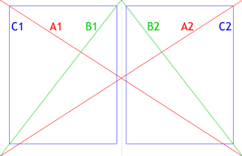
Starting with a two-page spread, draw diagonal lines from one corner of the spread to the other (A1, A2).
Draw diagonal lines from the top-center of the spread to either bottom corner (B1, B2).
Draw a box with the same aspect ratio as your full page (C1), and place it so that B1 intersects the top-right and bottom-left corners of the box, and A1 intersects the top-left corner of the box. A good way to acheive this is to first draw a box the same size as your page, group it, and then scale it proportionally.
Once you have achieved margins that are to your liking, copy your box, and position the copy on your opposite page so that it satisfies the critera from step 3 (C2).
C1 and C2 are your live text areas.
A variety of margin-to-whitespace ratios can be achieved with this method, from the economical to the luxurious. You now have beautiful margins. Best of luck with filling in the rest.
I have for some time noticed it, but didn’t know what to call it until today. Affluenza: the disease of epidemic proportions that causes Americans to sacrifice their health, communities, and families, all for the senseless pursuit of owning stuff, or simply “wealth” to buy stuff. Apparently, there’s a TV show on it, a book, and seminars to help combat it (the friend who introduced me to Affluenza noted that perhaps to buy the book was to demonstrate that you have Affluenza). I love this quote from the Amazon.com book review:
“To live, we buy..all the while squelching our intrinsic curiosity, self-motivation, and creativity.”
Apparently this book won’t teach you anything you don’t already know, but it’s exciting to witness our society finally waking up.
Do I have affluenza? I score 15 points on the Affluenza Diagnosis Test, which puts me just below having mild Affluenza. Well, nobody is perfect, and it’s not like all posessions are bad. Some of the things that may or may not make me guilty of Affluenza:
I have a TV…and cable, even though I only watch one or two channels, an average of 1 hour a week.
My computer is always on.
I’m using my Air Conditioner today (we have over 100 degree heat index today!)
My car is a V6, and I drive to work about 4 miles every day at a speed of 30mph.
My personal belief is that if you truly have an intrinsic passion for something, owning a few things that help you exercise that passion is okay. That’s why I won’t count my two guitars, my CD’s, and my book collection. Perhaps I shouldn’t count my computer being on all of the time, because it enables me to exercise my passion for design and for the internet (I believe there is virtue, if used for certain things, in the information classification and transfer that the internet makes possible). Also, working alot of hours has been cited as a symptom of Affluenza, but I do that because I like what I do (not that I never work a few more hours than I’d actually like to).
Of course, the “passion” argument sucks, because someone could say “I have a passion for driving an obnoxious tank that gets 6 miles a gallon half an hour to and from work down the main arterial road of my city,” and that’s not cool. I guess if you’re concerned about it, ask me, and I will tell you whether you should make your purchase or not. I’ll get this all sorted out some day into a solid argument, but until then, just be careful.
A truly fascinating art project related to this from right here in Nebraska: Obsessive Consumption.
Sidethought: I wonder if our economy would just collapse if everyone were magically cured of Affluenza.
After reading it, the outlook for sustainable print design in America looks pretty bleak – not that personal experience has indicated otherwise. I asked my printer the other day if he takes special measures towards minimizing his company’s impact on the environment, and his response, with a confused look on his face, was “well, we recycle?” I’ll have to get him a copy of this manual – maybe to be responsible, I’ll just send him a PDF.
I’m also considering making the manual the subject of my book club one of these months. That, or/and Cradle to Cradle.
Today, good taste is often erroneously rejected as old fashioned because the ordinary man, seeking approval of his so-called personality, prefers to follow the dictates of his own peculiar style rather than submit to any objective criterion of taste.
Here’s another:
Since typography appertains to each and all, it leaves no room for revolutionary changes. We cannot alter the essential shape of a single letter without at the same time destroying the familiar printed face of our language, and thereby rendering it useless.
Reiterating the previous idea:
…the typographer is chained more than any other artist by the unalterable word…
Here is my one card for AIGA Nebraska’s Design The Hand You’re Dealt. It’s a somewhat De Stijl inspired five of clubs. It’s a simple design derived from a varied scale, in which everything is in proportion to the length of each side divided by the aspect ratio. For example, the cards are 8″ by 12″, so the aspect ratio is 1:1.5, so the varied scale is 12″, 8″, 5.33″, 3.55″, etc.. Each side of all of the elements on this card are one of these lengths, and many of them are the same aspect ratio. There’s still alot that’s arbitrary about the design, I’m sure, but at least I can pretend there isn’t.
I saw this odd scene on my way into the UNO Library today. Browsing through the design book section there, I happened to run into Design of Warning Labels and Instructions. If I get around to reading it, I’ll be sure to tell you about it.