
Subscribe to Love Mondays newsletter updates via email »
LM: #369: The screens are too damn bright
The past couple months I’ve set all of my screens to black-and-white: My phone, laptop, tablet, watch, and even the screen in my car.
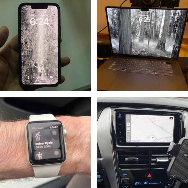
I haven’t yet looked into the neuroscience behind this, but it feels like it’s triggering far less dopamine than usual. I feel more in-control of my attention. Surprisingly, I’ve noticed I can more easily motivate myself to do simple tasks away from screens, such as clean or wash dishes.

WANT TO WRITE A BOOK?
Download your FREE copy of How to Write a Book »
(for a limited time)
This would make sense because, as Dr. Robert Lustig told us, our dopamine receptors habituate: The more you release, the more you need for a similar effect (until your receptors are shot).
I don’t that often need to temporarily switch the colors back on. I can do basic video and graphics editing just fine in black-and-white, and can quickly check the colors before I finalize.
There’s also a slider to change how strong the black-and-white filter is. I changed the filter for my car’s screen to just under full power, so I can better discern colors on maps.
Every time I switch colors back on, I am shocked how bright they are. It feels similar to tasting the sugar-laden foods all around us after a period without sweets, or exiting a matinee on a sunny day.
In fact, if you search for “dopamine colors,” you’ll see there are lots of articles cheerily guiding designers to use highly-saturated colors to hook users on their interfaces.
If we look at the hues that can be reproduced on a screen, they extend way beyond what can be reproduced with, say, CMYK offset printing.
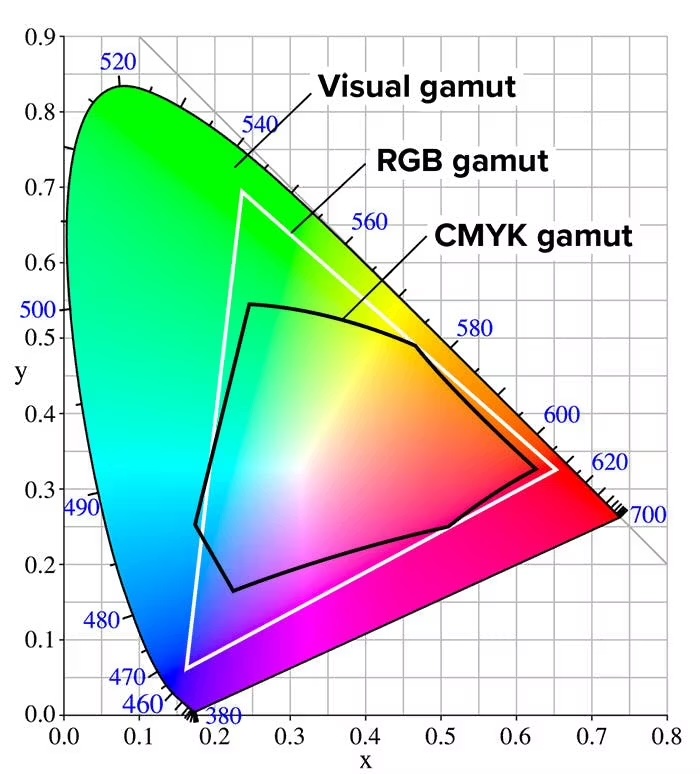
The only hues in the CMYK color-space that come close to matching the RGB color space (screens) are the pure inks: Cyan, Magenta, and Yellow.
As this diagram shows, we’re actually able to perceive hues well beyond even the RGB color space, especially the greens and blues – you know, the actual natural world.
One thing I’ve noticed after two months in black-and-white is that flowers and birds seem brighter and more beautiful. It’s always a good thing when the real world is more interesting than your screen.
I will never again keep my screens in full color.
Book: Amish Society (Amazon) is about the fascinating community that is intentional about technology.
Cool: This is the only sensible design for a Kindle cover (Amazon) and it’s strangely hard to find.
Best,
David