I spoke with Michael Braley the other day to ask him if he wanted to judge AIGA Nebraska’s awards show, which I am co-chairing this year with Donovan Beery from eleven19, but he couldn’t make it on the weekend in question. Darn. He gave an awesome presentation about his design process when I was going to Iowa State. That presentation had a strong influence on my design process, and I’d love for the design community in Nebraska to see it. Maybe I can get him to come for his very own event.
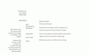
Here is an image of the type exercise I wrote about in my previous blog:
I used only proximity to establish hierarchy in the content (all of the type is the same size). One could also argue that I used different capitalization states. The relationship between space and form in this piece is also based on the Golden Section, but I can’t remember precisely how, nor would I like to reveal the “secret.” It’s still very arbitrary though, I assure you.
I have, for the time being, abolished ornament on my blog. Yes, there is nothing but type on it. For usability’s sake, hyperlinks are still underlined, and the fact that I use color to differentiate information is perhaps questionable in this minimalist approach, but I feel much more free now that I have broken the chains of ornament.
It’s not so much that I think that ornament is evil. I do this to make a statement. Graphic Design’s academic programs, from what I have seen, have chosen to concentrate on visuals, and the copying of “styles,” at the expense of their students’ sensitivity to form and space.
Something such as a blog is, in it’s sublime sense, purely information. Most blogs take advantage of the wonderful semantic markup of the web, which, when used wisely, enables search engines such as Google to find the most relevant information to what you are searching for. There’s increasingly more information out there (duh!) so relevancy is more important than ever. It seems that many college Graphic Design curriculums have forgotten that Graphic Design all starts with the transfer of information (this all feeds into my disdain for all-Flash websites and text in images, but that is for another post, and maybe not even then, because (futile) attempts to pound these concepts into the heads of members of the general Graphic Design community have been made) and I don’t mean “information” as in some esoteric, masturbatory, “concept” you are trying to support, I mean information…the useful kind.
So, rather than learning about typographic nuance, students must resort to rummaging through CA to decide what “look” to copy (many of these “looks” are simply rip-offs of the pop-culture graphics of yesteryear). So, I present to you an exercise in space and form. The form being the letters and word-images, and the space being the space between these forms. It’s like that exercise in school that was a great exercise when taught at the Basel School of Design, and was supposed to teach you that the only necessary factors for establishing hierarchy are: proximity, size, weight, color (I’ll omit “visual punctuation” for the sake of supporting this theory that I simply do not have time to assimilate irrefutable information on), but that somehow got bastardized by your reconstituted design school’s curriculum. In my case, we were assigned to typeset a recipe, which has a hierarchy depth of TWO (ingredients and steps). A couple years later, when I finally realized what the actual objective of that exercise was supposed to be, I had to resort to independently re-typesetting the information on a deodorant bar to truly understand the nuances that establish hierarchy (I’m dead serious…I still have the files if you want to see them).
P.S. I have had the honor of being invited to be an author at Be A Design Group and this post, as well as some other future posts, will appear there as well as here.
After reading it, the outlook for sustainable print design in America looks pretty bleak – not that personal experience has indicated otherwise. I asked my printer the other day if he takes special measures towards minimizing his company’s impact on the environment, and his response, with a confused look on his face, was “well, we recycle?” I’ll have to get him a copy of this manual – maybe to be responsible, I’ll just send him a PDF.
I’m also considering making the manual the subject of my book club one of these months. That, or/and Cradle to Cradle.
Today, good taste is often erroneously rejected as old fashioned because the ordinary man, seeking approval of his so-called personality, prefers to follow the dictates of his own peculiar style rather than submit to any objective criterion of taste.
Here’s another:
Since typography appertains to each and all, it leaves no room for revolutionary changes. We cannot alter the essential shape of a single letter without at the same time destroying the familiar printed face of our language, and thereby rendering it useless.
Reiterating the previous idea:
…the typographer is chained more than any other artist by the unalterable word…
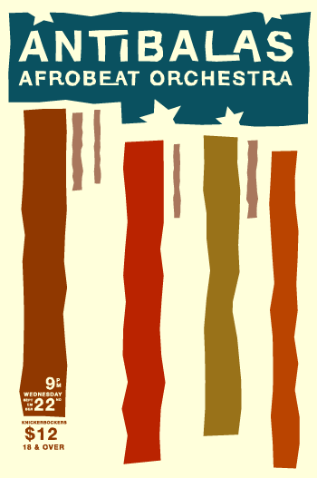
I just completed my latest fun side-project: a poster for Antibalas Afrobeat Orchestra, and more importantly, for One Percent Productions, who organize the absolute best rock shows in Omaha (the music scene is the best thing about living in Omaha). So here is the poster that will decorate the streets of Omaha (and Lincoln…this happens to be for a Lincoln show).
Yes, it is a little Saul Bass inspired. It started out as a visual interpretation of the music. I had some blobby forms to represent the sounds of the horns, some dots for percussion, and the still surviving vertical bands are what the organ sounds like. I felt it should look a little political too, a fact you can’t ignore if you hear their music.
A little disclaimer: the political nature of this band has nothing to do with me doing for a poster for them. The opinions they express are not necessarily mine.
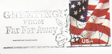
Have you noticed the Shrek Postmarks from our friends at USPS?
This makes me ill. One: pop culture is pervasive enough as it is (which is what makes it pop culture, I guess), and I would rather not have its agents shoved in my face everywhere I go. Two: its one more place you can’t look without being marketed to. Shocked a Graphic Designer is so anti-marketing, or rather this type of marketing? I’m not the only one.
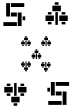
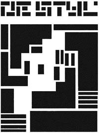
Here is my one card for AIGA Nebraska’s Design The Hand You’re Dealt. It’s a somewhat De Stijl inspired five of clubs. It’s a simple design derived from a varied scale, in which everything is in proportion to the length of each side divided by the aspect ratio. For example, the cards are 8″ by 12″, so the aspect ratio is 1:1.5, so the varied scale is 12″, 8″, 5.33″, 3.55″, etc.. Each side of all of the elements on this card are one of these lengths, and many of them are the same aspect ratio. There’s still alot that’s arbitrary about the design, I’m sure, but at least I can pretend there isn’t.
I have added a background pattern and framed the content with my parody of the ever-popular drop shadow. I’m tempted to resist the aqua-esque design trend and stick with pixel-by-pixel designs. I feel that it gives a good understanding to how all of the pixels work together, and while exaggerated, expresses the limitations of this medium.
Whenever I do work, or see work, that acknowledges the limitations of the pixel through exaggeration, it reminds me of the de Stijl movement, not only because the forms they derived from the principles of de Stijl are rectilinear, but because, in some cases, the form seems to derive from the limitations of the medium at hand. Granted, Mondrian’s paintings are counter-expressive of the inherent qualities of paint in contrast to the work of Van Gogh or Jackson Pollack, but seeing a piece such as Theo van Doesburg‘s logo for de Stijl Makes me suspect that maybe having a typecase full of only fonts and rectangular rules may have had a strong influence on its final form.