
Subscribe to blog updates via email »
Incremental Re-Design and de Stijl
I have added a background pattern and framed the content with my parody of the ever-popular drop shadow. I’m tempted to resist the aqua-esque design trend and stick with pixel-by-pixel designs. I feel that it gives a good understanding to how all of the pixels work together, and while exaggerated, expresses the limitations of this medium.
Whenever I do work, or see work, that acknowledges the limitations of the pixel through exaggeration, it reminds me of the de Stijl movement, not only because the forms they derived from the principles of de Stijl are rectilinear, but because, in some cases, the form seems to derive from the limitations of the medium at hand. Granted, Mondrian’s paintings are counter-expressive of the inherent qualities of paint in contrast to the work of Van Gogh or Jackson Pollack, but seeing a piece such as Theo van Doesburg‘s logo for de Stijl
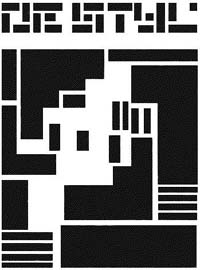
Makes me suspect that maybe having a typecase full of only fonts and rectangular rules may have had a strong influence on its final form.
WANT TO WRITE A BOOK?
Download your FREE copy of How to Write a Book »
(for a limited time)