Subscribe to blog updates via email »
2008 vs. 2013: Reverse-Engineering the Redesign of kadavy.net
It has been nearly 5 years since I redesigned my blog. I admit it: It was a bit “out-of-date,” or “dated,” as some may put it (especially for someone who wrote a book claiming to dissect every aspect of design). But what does it mean for a design to become “dated?” How is it possible that something that at one time looked “good” starts to look “stale,” or even just plain “bad?”
Here’s the TL;DR
- Less IE, more iOS, and the need for Responsive Design made my site look dated
- My goals are different now
- User culture is different now
- Text should be big, lines short, and design simple (but not too simple)
- I’m hosting on WPEngine, and you can save with my coupon code
- Get an under-the-hood screencast
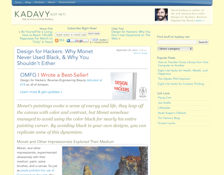
As is true for any artifact of humanity, there are forces that bring said artifact into being, and forces that shape the form of that artifact. Over time, those forces change, as that artifact remains the same. This is how something begins to look “dated.” Here’s what a blog post page on my site used to look like. I last redesigned it in May 2008.
WANT TO WRITE A BOOK?
Download your FREE copy of How to Write a Book »
(for a limited time)
With my 2008 eyes, that design looked pretty good. With my 2012 eyes, it looked cluttered: too many elements, too many colors, too many subtle spacial relationships trying to organize all of it. To remember why the design looked like this, I took a look at the technology my users were using in April 2008.
Technology, Culture, Intentions
The overarching viewpoint behind Design for Hackers, is that technology, culture, and intentions of a design work together to shape that design. Here is how those factors interacted to produce the new kadavy.net, starting with the technology.
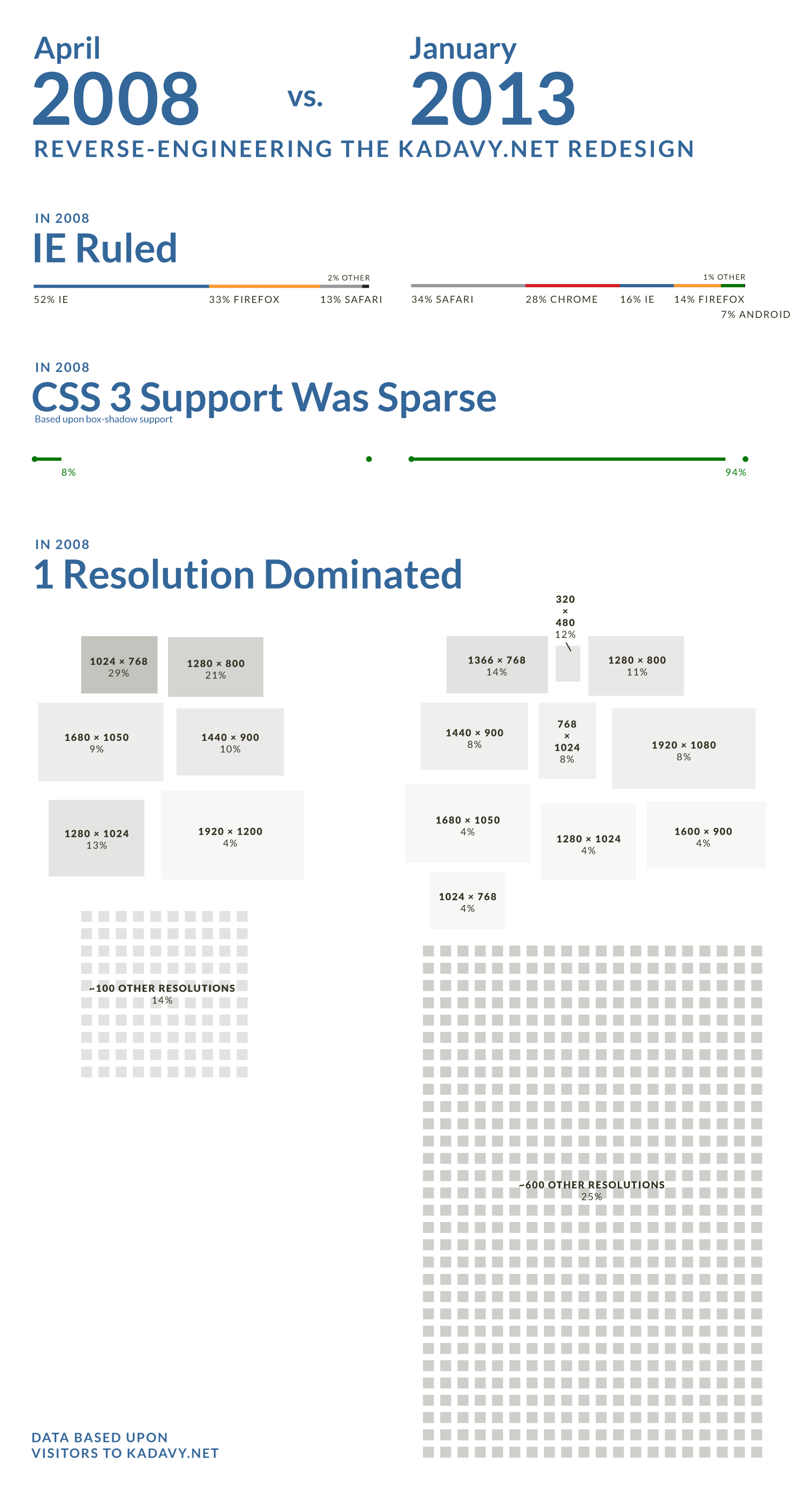
Cause: Internet Explorer acted like Internet Explorer
In April 2008, 52% of my users were using Internet Explorer. 71% of those users were on IE 7. I didn’t even bother with IE 7 on this redesign. In fact, IE 8 – the oldest version of IE I’m (loosely) supporting – comprises only 4% of my visitors today.
Effect: Less than pixel-perfection
Because so much time development time was eaten up trying to get things to look good on IE 7, and IE 6, it was hard to get very picky about the placement of different things. This often resulted in things being off by a couple of pixels, and simply accepting that as part of the design process.
Cause: “iOS” as we know it, didn’t exist!
In April 2008, .26% of my visitors were on the “iPhone” platform. That’s .26%, not 26%. Today, 24% of my visitors are on an “iOS” device of some kind.
Effect: more “stuff” on the page
In 2008, we were designing for a different kind of user. They were almost certainly using a computer, rather than a mobile device, and chances are they were even using a desktop computer. Once a user was on your site, you had a better chance of funneling them into another part of your site.
Cause: One resolution ruled
29% of my visitors in April 2008 were on 1024 x 768 resolution screens. It was the most popular of roughly 100 different screen resolutions of my visitors. 100 may sound like a lot of different screen resolutions, but in January 2013, visitors had 600 different screen resolutions.
Effect: more granular layout, one layout fits all
In 2008, desktop users ruled. They had longer attention spans, larger screens, and most of their screens were about the same size. You could just stick to a 960px wide grid and fill it full of stuff. Since they were desktop users, they didn’t need as large of click targets either. This made it very common to have three or more columns in a layout. A user could scan around the page with their eyes, and if something grabbed their attention, they could just click on it. These days, we don’t have so much real-estate to work with, and I posit that users get impatient more quickly if they’re unable to find what they’re looking for.
My Intentions: 2008 vs. 2013
In 2008, my goals for kadavy.net were far different than they are today.
- My career was less-defined: When I redesigned in 2008, I had spent about a year moworking at cafes around San Francisco experimenting with different projects after leaving my last job. I had had my fill of living in The Valley and was on the cusp of escaping to Chicago where I could explore my own creativity outside of the noise. I wasn’t sure what I was going to do. My plan was to make the minimum amount of money needed, and spend the rest of my time trying to unlock what was in my brain. So, I was experimenting with writing on a wider variety of subjects, while also experimenting with hackathons, video, acting, and improv. A couple of months after my redesign, I made a presentation on the idea that would eventually lead to Design for Hackers.
- I wanted freelance work: I had been living off of savings for a year, and it was time to make at least a little money. So, I had a portfolio to showcase my work. Not long after moving to Chicago, I landed oDesk as a client. They came across my blog and got in touch with me. I loved their mission, and they had just the right workload to get me through the next year of experimentation. These days, researching design to try to make great content and talks is a full-time job for me, and luckily I have some passive revenue coming in to help get me to the point where that is what I’m actually making my living from.
- I wasn’t sure what I was an expert on: When my 2008 redesign launched, I wasn’t writing about design at all, and instead was mostly writing life hack type things. This genre is still important to me, and I plan to keep writing on it, but I’ve recognized and accepted that I can make an impact writing about design. It’s funny, looking back I remember I often got frustrated when people would introduce me as “a designer,” when I thought of myself as an entrepreneur. Sometimes the observations other people make about you are more lucid than the ones you make about yourself.
Compare that with my goals today for kadavy.net
- There is nothing more important than this post: 99% of visitors to kadavy.net land on a blog post, so the content of that blog post – the reading experience of that blog post – is the most important thing. Why try to distract the user with a “Popular Posts” widget, a blog roll, and a search box when 90% of visitors bounce? I’d rather use the quality of the content and the reading experience to compel them to investigate more. They can do so through the “best of” on the home page or by clicking through to category archives.
- Buy my book: I still do (and plan to continue) to write about things that interest me outside of design, such as entrepreneurship and productivity, but my book is my calling card. After all, it encompasses my entire viewpoint on what makes good design – which I’m not too humble to admit is probably the thing that I know the most about. So, in what limited space isn’t dedicated to this post, my book is the one thing that I’m promoting.
- I wanna talk: In the nearly 18 months since Design for Hackers was released, I’ve had the privilege to travel the world speaking about design. I’ve now spoken in 5 countries on 3 continents, including all over the U.S.. I love speaking, so I want to do more of it. So, my blog now has a dedicated “speaking” page. If you’re organizing something, let’s talk.
- Twitter matters: In 2008, I had been on Twitter for several months, but – after initial excitement – hadn’t recognized the value of it. Things are of course different today, and Twitter is an important place for dispensing and testing thoughts and directions I’d like to go. So, I’ve gotten rid of most widgets from other networks and am concentrating on Twitter. By the way, are you following me?
2008 User Culture vs. 2013
The technology of 2008 and my own intentions are of course tightly intertwined with the culture. Here’s how today’s user culture differs from that of 2008
- Affordance is cheap: My audience has used a computer before. You might be surprised to know that the majority of my audience isn’t the Hacker News crowd, but the general public is far more familiar with how to interact with a website than they were 5 years ago. Even the Neilson Norman group doesn’t underline their links. We’re also seeing giant companies such as Google move toward a “flat” design style. So, I’ve gotten rid of colors for links, in favor of a light dotted underline. My navigation is now simply words where you would expect a navigation to be.
- Good design is expected: The bar for good design is way higher than it was 5 years ago. I could build an argument for this, but isn’t it self-evident? Users expect a better experience.
Guiding Principles
No matter how formulaic all of the above may seem, a design is also shaped in part by a designer’s point of view. Here are some things I believe that have also shaped this redesign.
- Text should be big: I think most of the text online is still way too small. Designers were used to designing for print, but you don’t hold a computer screen as close to your face as you do a piece of paper. Additionally, most screens still aren’t up to snuff with paper. So, I wouldn’t blame you if you think that the text on my new design is a little too large. It’s 28px on widescreen desktop, and that’s big, but for once you won’t be hitting Cmd + right upon visiting a site.
- Line length should be 45–75 characters: In part because of all of the small text online, in part because of the width of screens and the occasional abuse of responsive design, most sites have lines of text that are way too long. It’s an epidemic on even the most popular sites, even the most popular applications (I’m looking at you, Evernote Full-Screen Mode).
- Death to Ornament: As long ago as 2001, I have been fascinated by the power of white space, and the minimum needed variation to express visual hierarchy. That’s when I rearranged the text from the side of a deodorant bottle, trying to use nothing but white space to express information. Why use a different size of type when a little white space will do? Why use a different typeface when another size of the same will do? Why use another color when a different weight will do? I had tried to design kadavy.net without ornamentation in 2004, but a lack of control on the web along with the need for affordance made it infeasible. With this redesign, I attempt once again to utilize the power of white space wherever possible. (If you’re such a design freak that white space somehow interests you, be sure to sign up for D4H emails. I’ll have something for you soon.)
- …but, “flat design” is a bit much: I don’t doubt that “flat design” will be remembered as a historically significant design “movement.” It has all of the elements of such a thing (see my comparison of Impressionist painting and Web 2.0 in Chapter 4 of D4H). But, I feel it’s an overreaction to Skeuomorphism. Removing all texture and dimension from a screen doesn’t change the fact that screens are rather harsh as nothing more than blocks of color. Movies are skeuomorphs of live plays: do we have nothing but flat-shaped cartoons now? As much as I’m for measured visual changes to communicate meaning, I still feel that textures and dimensional effects are indispensable tools in the complex landscape of dynamic experiences.
- I’m a Humanist: The design of one’s personal site should be an extension of his or her philosophies. I see technology as a tool to augment and harmonize with humanity, not to overpower it. So, if I must check a text message whilst having dinner with you, I will apologize for it profusely, but I’m not ever likely to delete my Facebook account for not thinking it’s healthy. Similarly, I’d rather write and operate from my heart than to A/B test to optimize a result I desire. I’m not likely to have a background of pure white LCD, use a rationalist typeface such as Helvetica, or use bright neon colors in my site. I wouldn’t be me, and it wouldn’t evoke the feeling of sharing a pot of tea with me on a winter evening in a cozy cafe.
The Results
The above comprises the most important facts, thoughts, and feelings that have shaped the new kadavy.net, which is:
- Responsive, but not too much: With the variety of resolutions my visitors view my site on, there was no doubt that I needed a responsive design. But, a design should be responsive only to the extent that it improves the experience. So, there are essentially only 3 different modes, with a few tweaks made for iOS and other touch devices.
- Lato, a Humanist Google font: I’m a little weary of all of the typefaces available for use on the web today. Very few are really good, and most people using them don’t really know which ones those are. I wanted to use only one typeface, in order to demonstrate simple communication. My first choice was Martin Majoor’s Scala Sans, but it’s expensive enough that it wouldn’t do my readers much good to see it in action. I was very pleased to come across Lato though. It has a sense of being visually inert, yet it’s proportions and shapes are Humanist. Additionally, it looks surprisingly good on-screen, even at tiny sizes. It was designed by Polish designer Lukasz Dziedzic in 2010.
- Extruding navbar, disappearing header: There were just a few little bits of JavaScript magic that I felt were worth the trouble to execute. In pursuit of minimal affordance, I wanted the navbar of the site to be as inconspicuous as possible when first visiting the site, yet once the user had scrolled into the content, it needed to distinguish itself. The solution is a navbar that “extrudes” from the page while you start scrolling (this proved impossible to execute in iOS, so you’ll have to see it on a desktop). The other thing (also not visible on iOS) is the disappearing header. Sure, it would disappear when scrolling, but I liked the way a fading, static header seemed to say “all content on this site lives within this idea.”
- Appropriate alert: People sharing my articles is really important to their success. Plus, remember that book of mine that is so important to this site? In the wider desktop versions of the site, a “notification bar” pops up as you near the end of an article. That is, of course, the appropriate time to ask for sharing and tell you how you can engage further with my thoughts. Since many people who share may not even get to the end of an article, I was tempted to mess with some of those buttons that float around next to content, but remember that “there is nothing more important than this post.”
The one agonizing disappointment is that I can’t style the Disqus comments because they’re in an iframe. Don’t get me wrong: they look good – they just aren’t as integrated with the look of the site as I would like. This is my first time using them, so hopefully the features will be worth it.
Credits
Initially, I considered hiring someone to code and even help out with design, but I ended up handling that on my own. It was a good experience in catching up with HTML5, LESS, CSS3, and JavaScript. But, I have to thank Alex Baldwin, who has been an invaluable advisor in keeping abreast with front-end technologies. Also, Aaron Crowder helped with the translation of static HTML into a WordPress theme. Of course, there are numerous others who have been a big help on Twitter, or on the D4H email list. The background texture used is “Cream Dust,” created by Thomas Myrman and posted on subtlepatterns.com.
Lovingly Hosted on WPEngine (get 25% off)
A few years ago, I messed around with WordPress Optimization on Rackspace. But, it turned out that I didn’t enjoy (and wasn’t very good at) managing my own server. I got tired of updating it, trying to set up my own CDN, getting hacked, and having to worry about backups and traffic spikes. I’ve since hosted sites on several of the available hosted WordPress solutions, and have concluded that WPEngine is the best one for me. So, the new kadavy.net has a new home on WPEngine. They keep my WordPress up-to-date, keep it secure and backed up, make it fast, and handle scalability. From the other providers I’ve tried, they have the best user experience (“how the %&*# do I get into my SFTP again?”) and customer service. They’re going to cost me a few bucks more than the other providers, but I’m serious enough about my blog that it’s worth it for me. If you want to try them out, I’ve lined up a special coupon for them just to celebrate the redesign. Get 3 months free with this WPEngine Coupon Code (when paying for a year up-front).
Get a look under the hood: D4H newsletter
If you’ve enjoyed this run-down, and would like to learn more about the technology and process behind my redesign, I’m preparing an under-the-hood screencast just for folks on my Design for Hackers newsletter that will cover:
- Proportions: how did I choose font sizes and dimensions, and how did I integrate those choices with the technology. See how I used LESS to make these choices easy to adjust and maintain across responsive design breakpoints.
- Responsive Design: I’ll explain how I balanced effort with results to chose the responsive design breakpoints I did, and what design choices I made to make each breakpoint look its best.
- CSS3, LESS, and rems: I’ll explain some of the advanced CSS3 techniques I used, how I organized my LESS files, and how I used rem units to make a beautiful design with minimum coding.
I’ll be sending this screencast to D4H list members for free – one time only – on February 26. You can sign up here.